Role
User Research
Product Strategy
UI Design
Interaction Design
Usability Testing
Tools
Figjam
Notion
Maze
Figma
Otter
Timeline
5 weeks
Users don’t understand the value of cold shower therapy and are unsure where to start on their journey. They are feeling a lack of meaningful progress cues and information disclosure.
The Solution
By emphasizing the cold water challenge day-to-day progress, and helping ease the user into a more guided meditative headspace we were able to increase the user's buy-in to the Wim Hof overall experience.

Usability Review
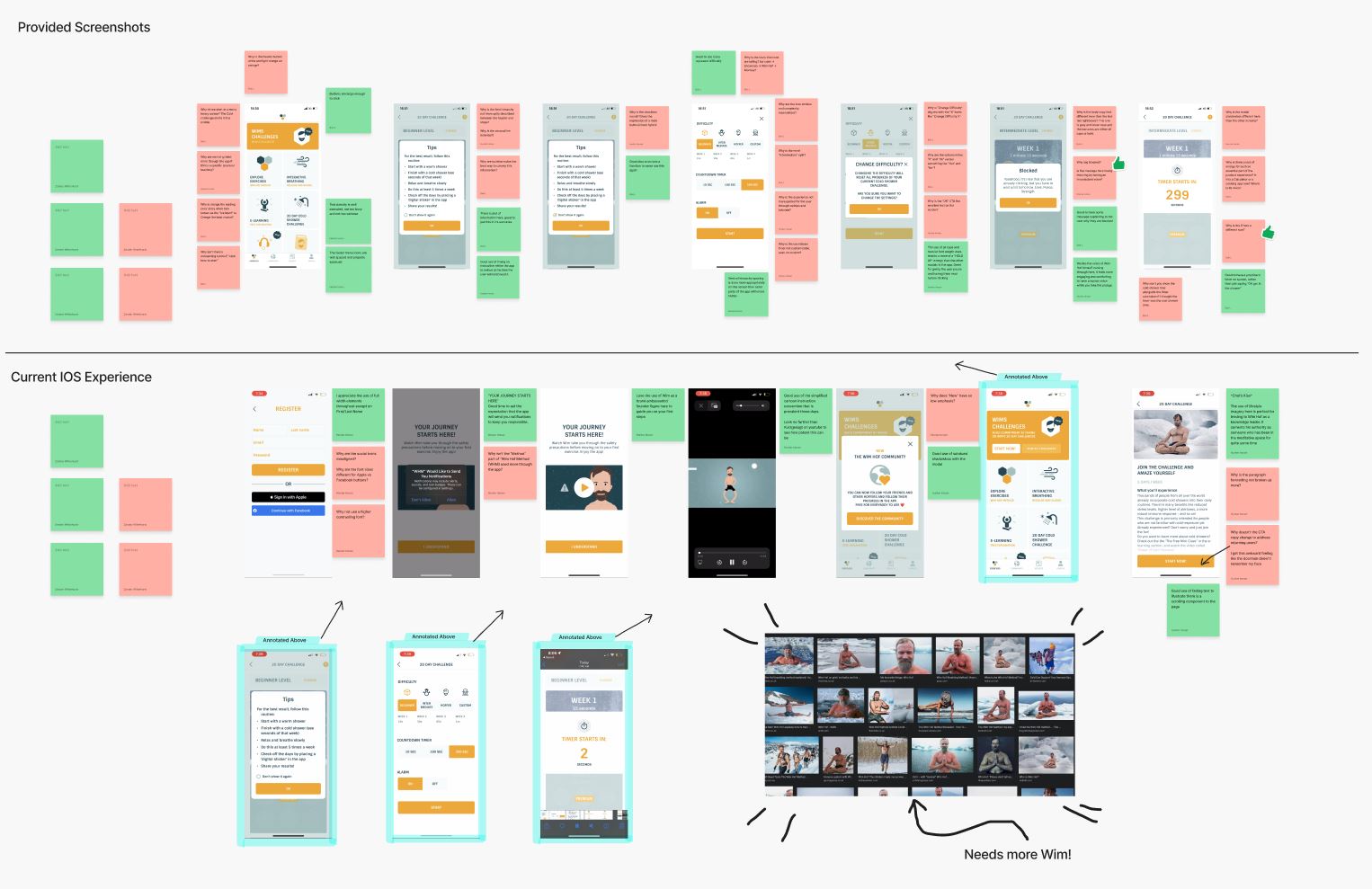
To help us better understand the product, we conducted a usability review to identify pain points and wow moments in the existing experience.
Business & User frustrations
Following a usability review we defined the primary and secondary business and user frustrations
Primary Frustration
When new users are being onboarded with the beginning 20-day cold water showering exercises, they are facing an issue with lack of information disclosure and meaningful progress cues. This results in a increased rate of abandonment during the initial exercises, and ultimately reduced conversion to paid users.
Competitor Benchmarking
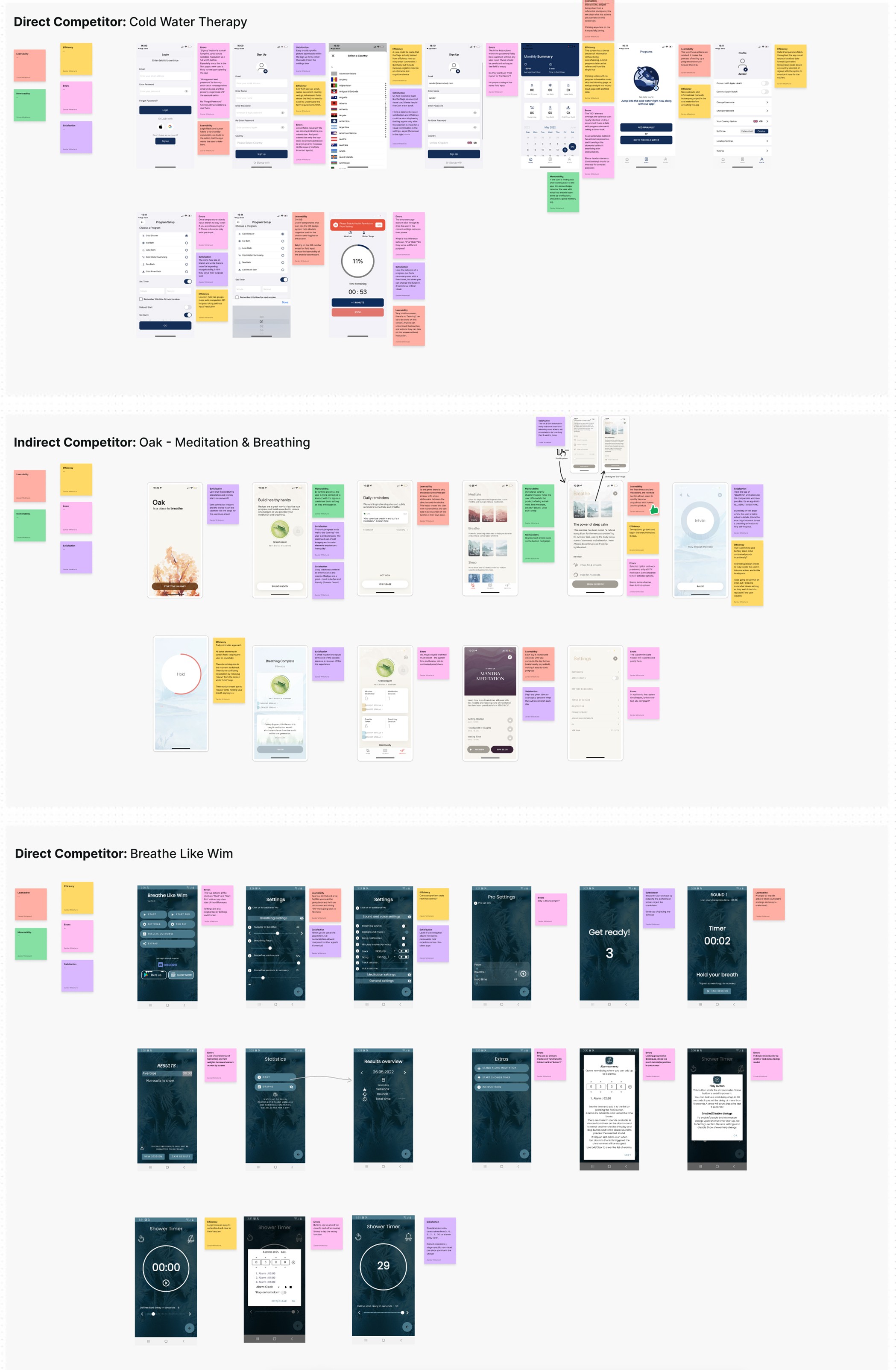
With a usability review complete, we moved on to competitor benchmarking to help us identify standards in competitor products that could be used to improve the existing experience.
Problem Space
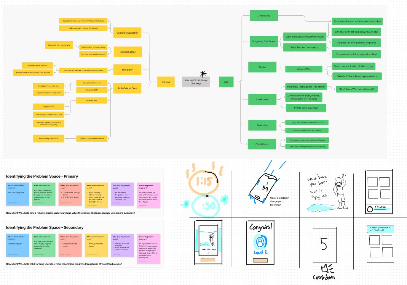
Combining our initial usability review and competitor benchmarking helped us identify the problem space to begin ideation.
Who is affected by the problem?
New & returning users are affected by the problem.
What is the problem?
Users don’t understand the value of cold shower therapy and are unsure where to start on their journey. They are feeling a lack of meaningful progress cues and information disclosure.
Where does the problem occur?
• On the 20 Day Cold Water Shower Settings Screen
• On the 20 Day Cold Water Timer Screen
• On the 20 Day Cold Water Completion/Results Screen
When does the problem occur?
• When choosing a difficulty setting
• When interacting with the timer before & during the shower
• After you finish the shower and conclude the activity
Why does the problem occur?
• Activity settings are too unrestricted (too many CTA)
• No guidance for beginners or experts
• Experience ends abruptly
• Progress does not feel meaningful
Why is the problem important?
Without guidance, the user isn’t motivated to buy into the Wim Hof journey or feel the need to reach and progress goals set by the app. If they feel their progress has value, it’s more likely they will convert to a paid subscription.
How Might We…
With a picture of the problem at hand starting to come into place, we jumped into the ideation phase and worked through the solution design model, identifying users actual behaviour, and optimal behaviour. This allowed us to form a how might we statement to begin forming a solution.
How might we make a more guided experience to help new users understand and value the shower challenge journey?
Ideation
To avoid following the first idea we conducted a series of ideation techniques. This allowed us to consider an array of solutions. Following ideation we mapped what could be improved or added to the product and what the impact of each idea would be for users and the business.
What can we add
Gamification of the progress metrics through progress levels and a badge system
What can we improve
Narrowing the activity user flow to provide a less open-ended, more linear experience
User Flows
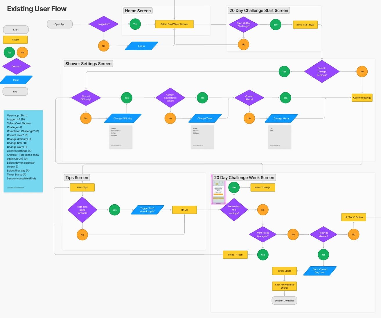
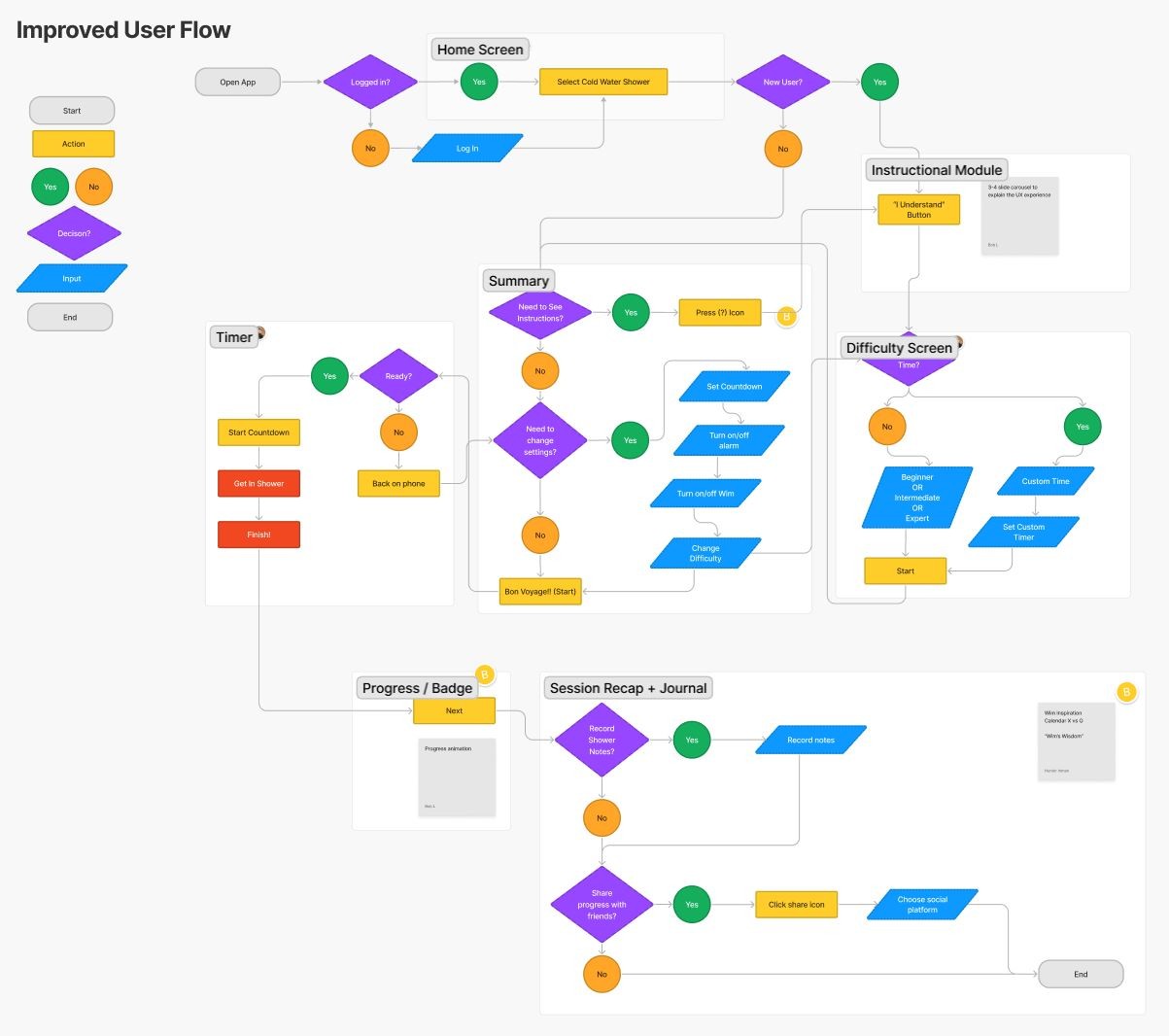
Following Ideation we created user flows of the existing experience and improved the flow based on the idea that fit with business and user goals
Rapid Prototyping
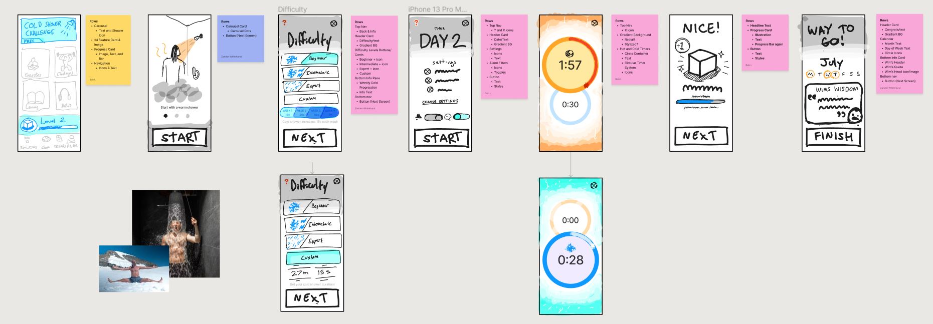
Having mapped an improved user flow we spent time rapidly prototyping a solution. Sketching helped us rapidly iterate on the original idea and visualize a solution without committing too early to hi-fidelity screens.
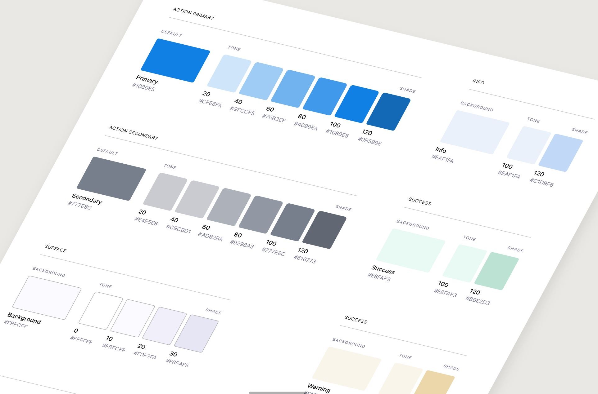
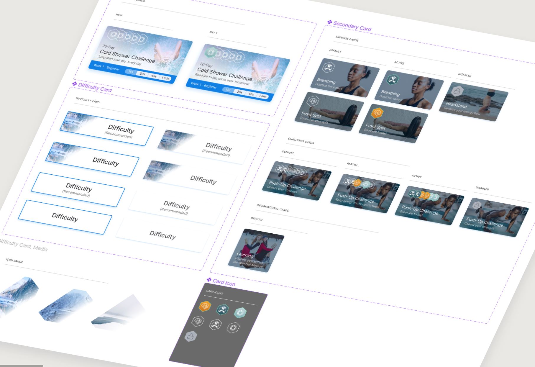
Styles & Components
Before creating the hi-fidelity prototype I defined the product styles and interactive components in Figma to easily and quickly help me design consistently
High Fidelity Prototype
Below is the final version of the prototype that we created. We included interactions and transitions from Figma to match the products flow.
Usability Testing
With the prototype created we formed a testing script with scenarios and tasks for the user to complete to validate the prototype with real users. To test the prototype we used Maze and gathered feedback following every task.
Test outcomes
Having tested the prototype, I learned most users greatly adhere to the journaling prompts after the shower which should improve overall buy-in to the activity and help the user track their mindset through the duration of the challenge.
Three key learnings
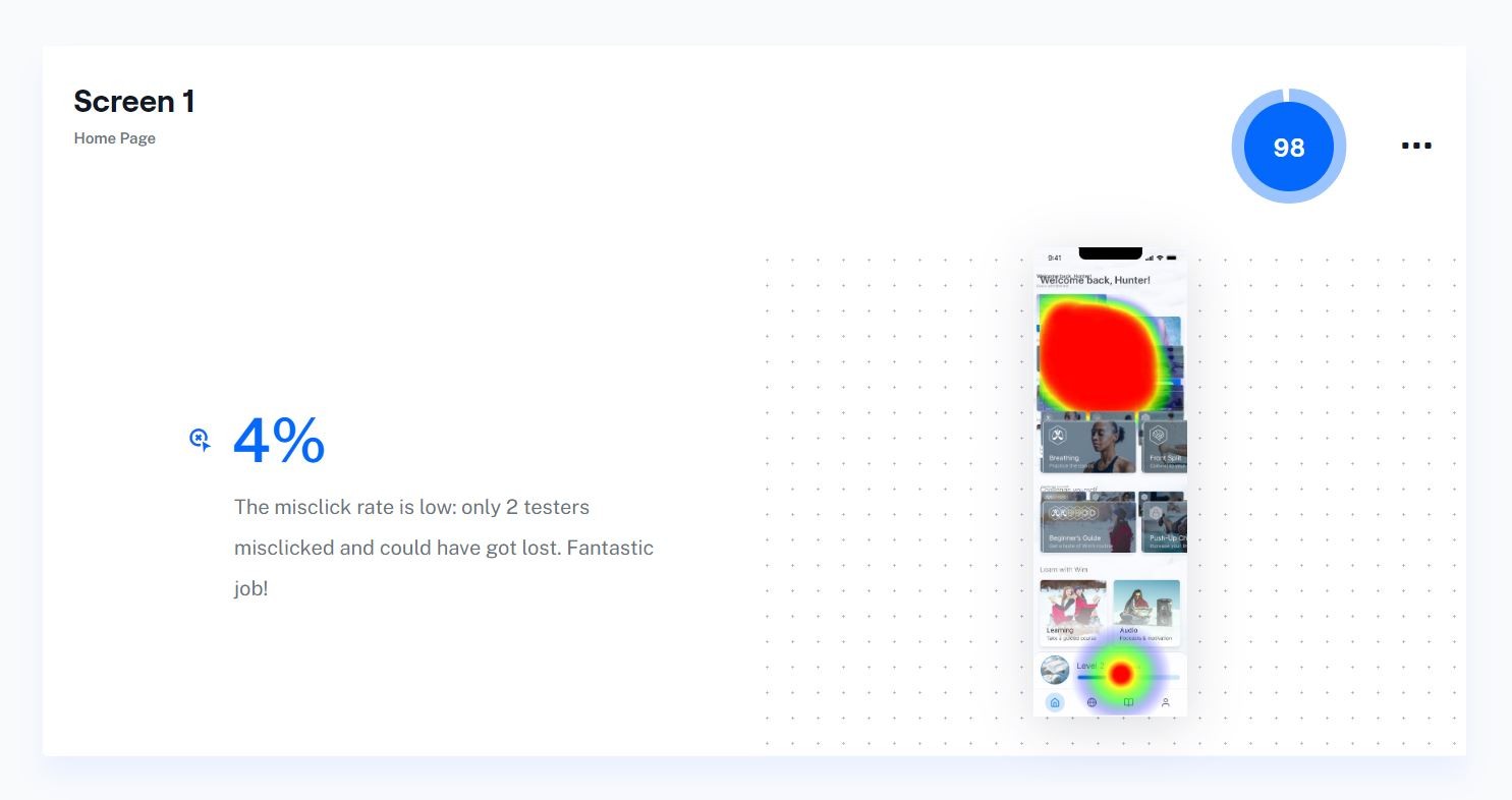
1. Almost all friction for finding the cold shower challenge was removed by making it the first and most prominent element in the home page’s visual hierarchy.
2. There needs to be a finer balance between the slower, deliberate animations in the app that lend to the feel of a cold, meditative experience and the user expectation of a snappy experience.
3. The note journaling and progress indicators within the results screen of the challenge is incredibly effective and the users are delighted with the experience, though the task is very high cognitive load so there will always be users who forego it completely.
Next steps
The results from my unmoderated usability test were varied, with some positive outcomes alongside areas for me to learn from to further refine the app.
If I were to iterate further on the app based on these results, I would concentrate my efforts on more development of the ‘daily shower settings’ screen, which serves as a touchstone for the rest of the activity.
The "What" and "Why" instructions of the activity can be more prominent and supplementary to the "How", to help fully contextualize the experience.
