Role
User Research
Product Strategy
UI Design
Interaction Design
Usability Testing
Tools
Figjam
Notion
Maze
Figma
Otter
Timeline
5 weeks
All users aren’t given equal permission to create and regulate groups resulting in a lack of autonomy and security for other group members. The lack of agency and functionality keeps users from adopting the group feature, leading to less users sharing their homes on MyPlace.com.
The Solution
We identified several ways to make users feel more secure and empowered when sharing their home. By removing friction during group creation, and adding privacy copy and functionality, users can more easily share their homes to MyPlace.
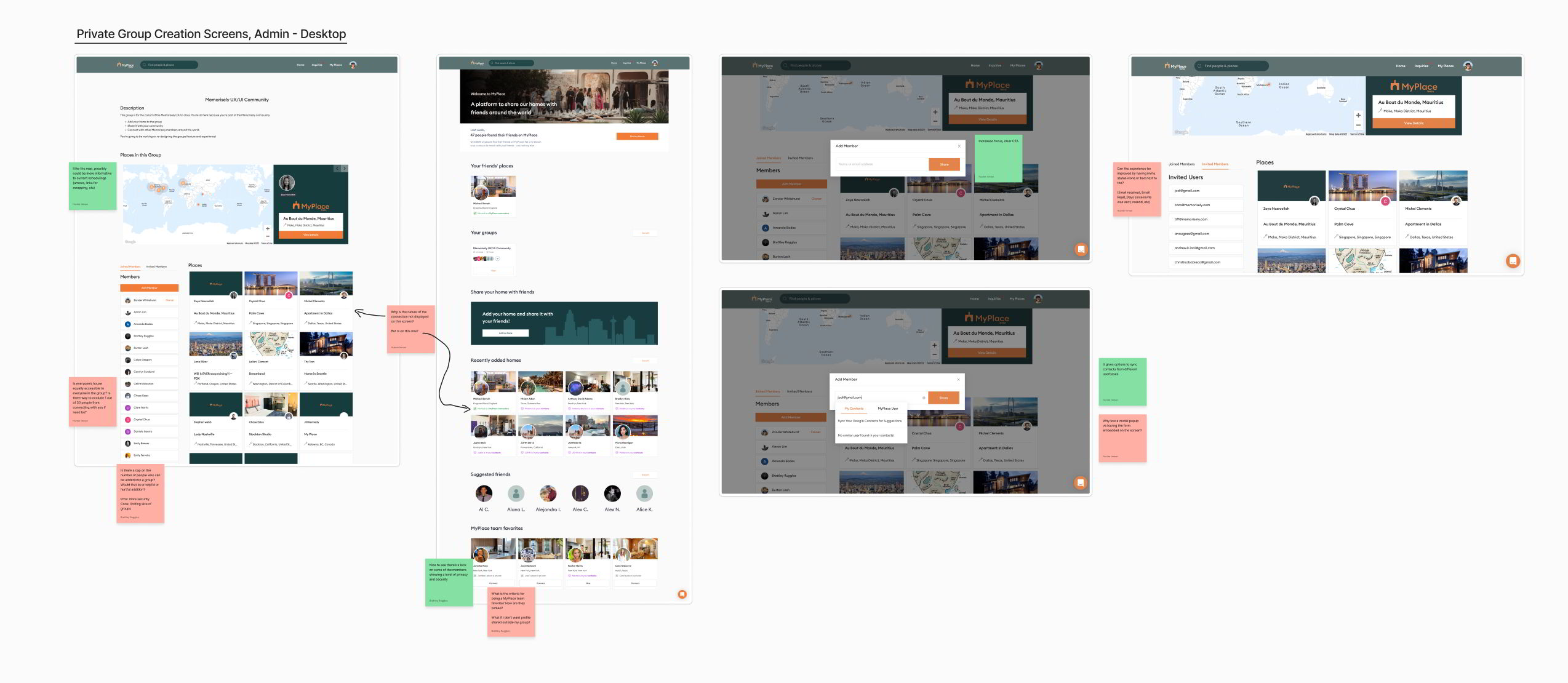
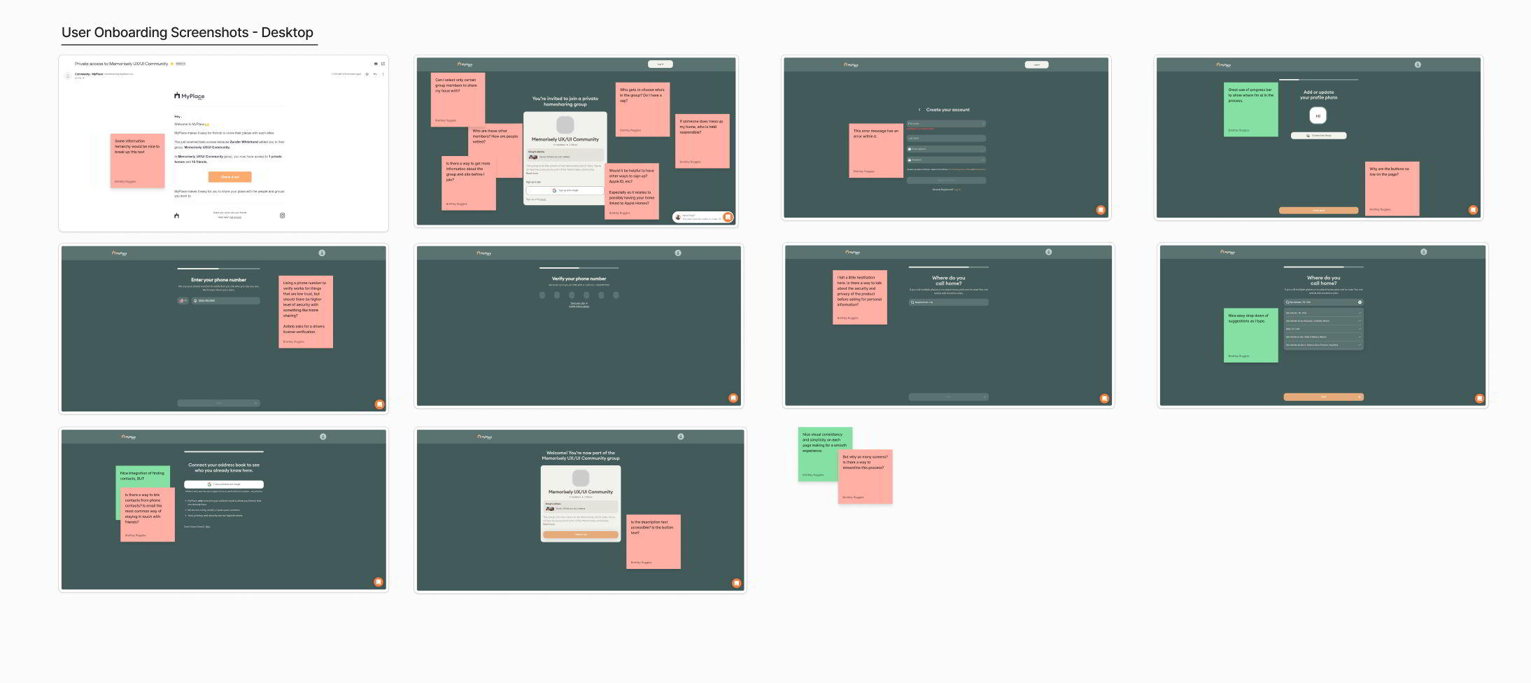
Usability Review
To better understand the product and empathize with users, we conducted a usability review and highlighted pain points and wow moments in the existing experience.
To get a comprehensive view of this segment we tackled it from two perspectives:
The perspective of the designated admin user inviting other members
The perspective of the other members receiving invitations and joining the group
Business & User frustrations
Following our usability review we defined the primary and secondary business and user frustrations.
Primary Frustration
When creating a group users are limited or restricted from being able to create a group which results in loss of autonomy and excessive friction in users adopting the group feature of the platform.
Secondary Frustration
When creating or joining a group users are experiencing a lack of personal security and agency which results in users feeling powerless and less trusting of the MyPlace experience.
Competitor Benchmarking
With a usability review complete, we moved on to competitor benchmarking to help us identify standards in competitor products that could be used to improve the existing experience.
Problem Space
Combining our initial usability review and competitor benchmarking helped us identify the problem space and outline our research goals to prepare a script for our upcoming interviews.
Summary of Problem Space: All users aren’t given equal permission to create and regulate groups resulting in a lack of autonomy and security for other group members.
How Might We Provide a Smooth and Assuring Group Creation Experience?
User Interviews
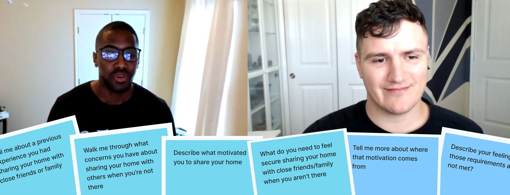
To gather qualitative data and empathize more deeply with user needs and frustrations we embraced user interviews as another research method.
We began by creating a research interview script that aligned with our primary research goal. We prioritized objectivity by asking open-ended questions and clarifying follow-up questions.
Once we landed on a functional script free of leading questions and biases, we interviewed several candidates who had experience with sharing their homes in the past.
Affinity Map
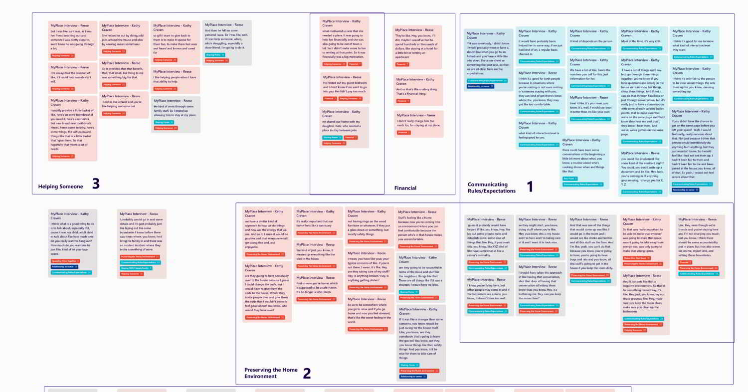
With the recordings from those interviews, we leveraged Otter.ai to transcribe 50+ minutes of audio/video to visually organize our conversations in a way that could be visually parsed and annotated.
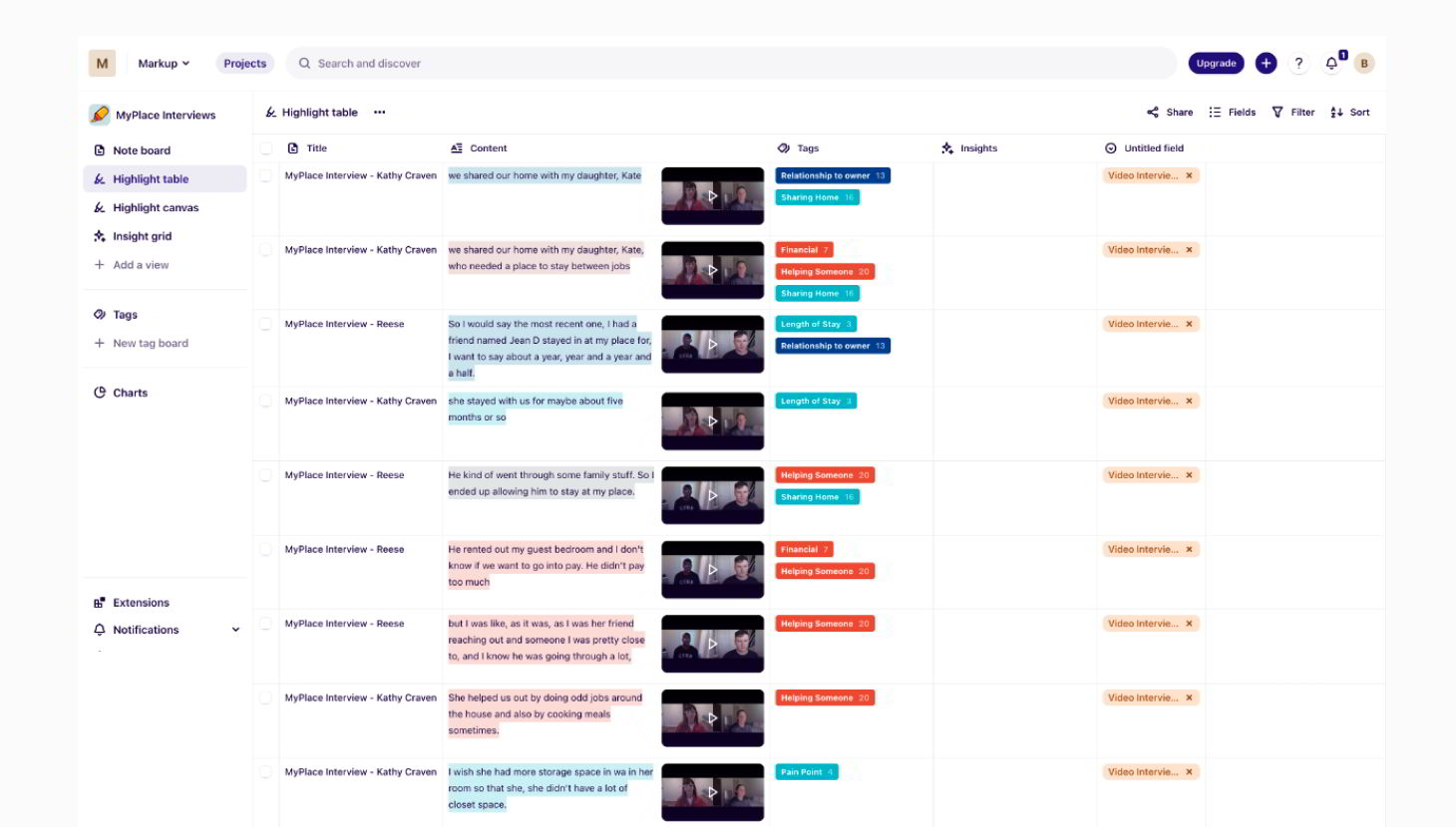
To validate the initial observations made from our usability review and competitor benchmarking we synthesized the data using Dovetail. By incorporating tag taxonomy to highlight nuggets of information within the interviews, we were able to identify the key problems they experienced.
Primary Insight
Communicating Rules & Expectations is critical to users feeling secure
A common theme mentioned by users is whether or not they feel “on the same page” with guest staying in their home. In every case this kind of communication was very important to users.
Secondary Insight
Preserving the existing home environment is critical to maintaining trust
A common theme mentioned by users is whether or not they feel confident that the person they are inviting into their home will maintain the energy and standards already in place.
In many cases users used possessive language to indicate the high effort expended to establish a certain energy in their dwelling.
Information Architecture
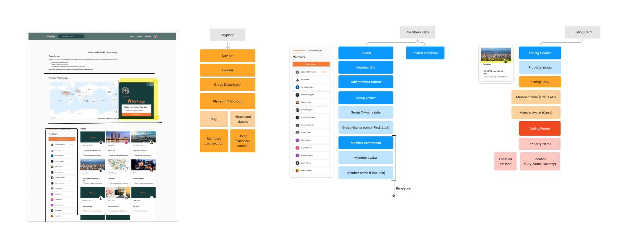
Next, we mapped the current information architecture to better understand how we might improve it so users can easily adjust to the functionality of the product and find everything they need with ease.
Ideation
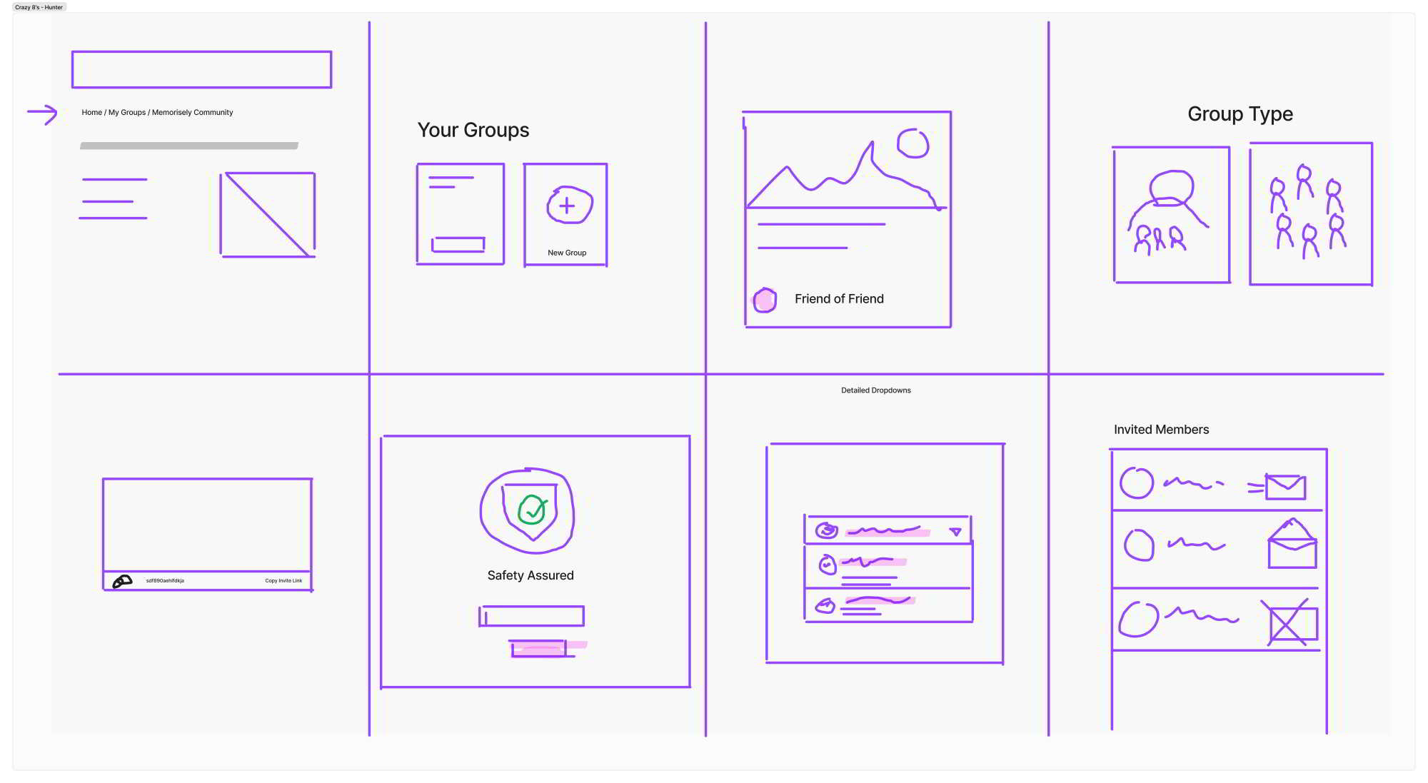
To explore ideas collaboratively we conducted a series of ideation techniques. We started with “Crazy 8’s” using time as a constraint to generate quick, judgment-free ideas.
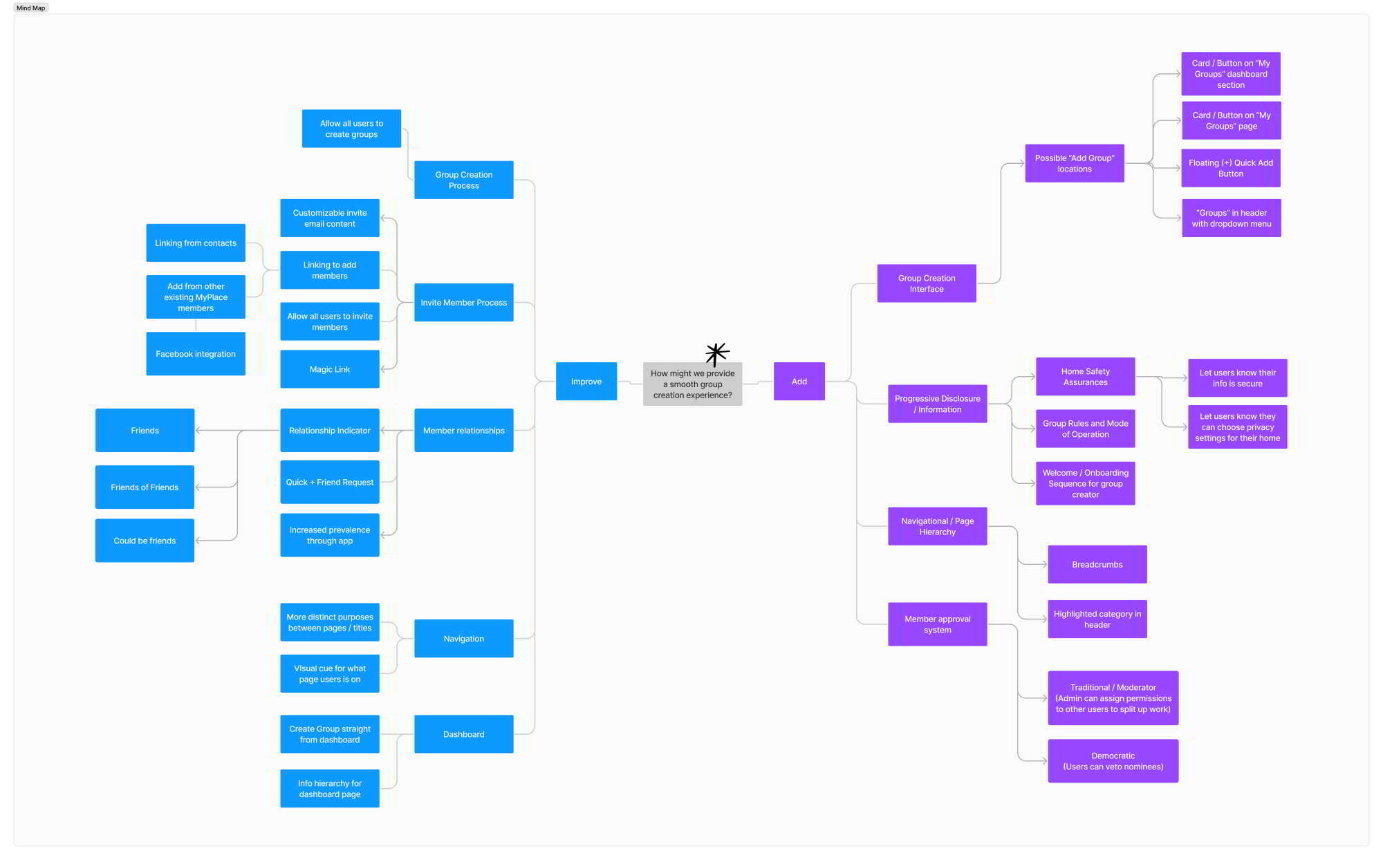
We then built a mind map to expand on those ideas and differentiate between which ideas were improvements and which would be additions.
What can we add
Given the inability to create a group through the existing interface, it was our highest priority feature.
What can we improve
The highest priority improvement is giving users the ability to manage the privacy settings of their groups.
User Flows
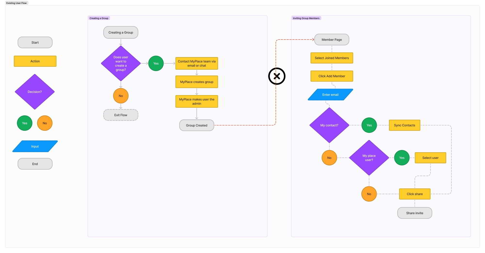
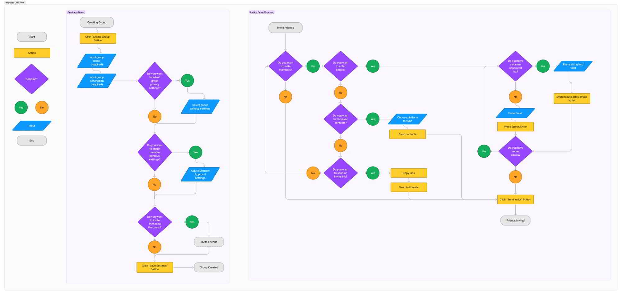
We then mapped the current user flow to better understand the current experience users have and highlight any areas of friction users might encounter within the flow. From there, we created an improved user flow focused on eliminating those friction areas.
Rapid Prototyping
We started the prototyping phase by sketching collaboratively in Figjam, and then moved into Figma to generate mid-fidelity frames that helped us quickly iterate on our original ideas and visualize a solution without sinking time into hi-fidelity screens prematurely.

Styles & Components
Before creating the hi-fidelity prototype we established the product styles and created interactive components in Figma to ensure an efficient and consistent design as we moved forward.


High Fidelity Prototype
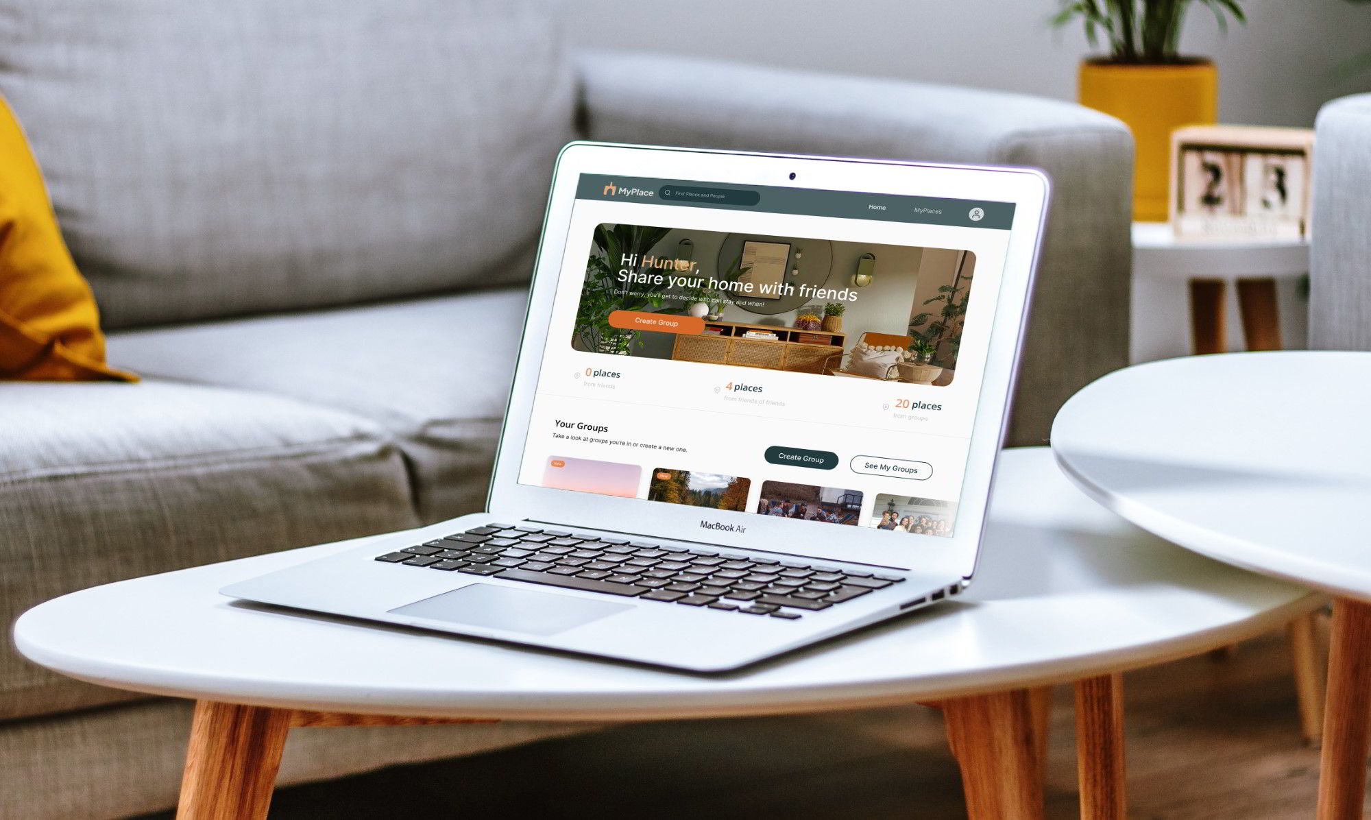
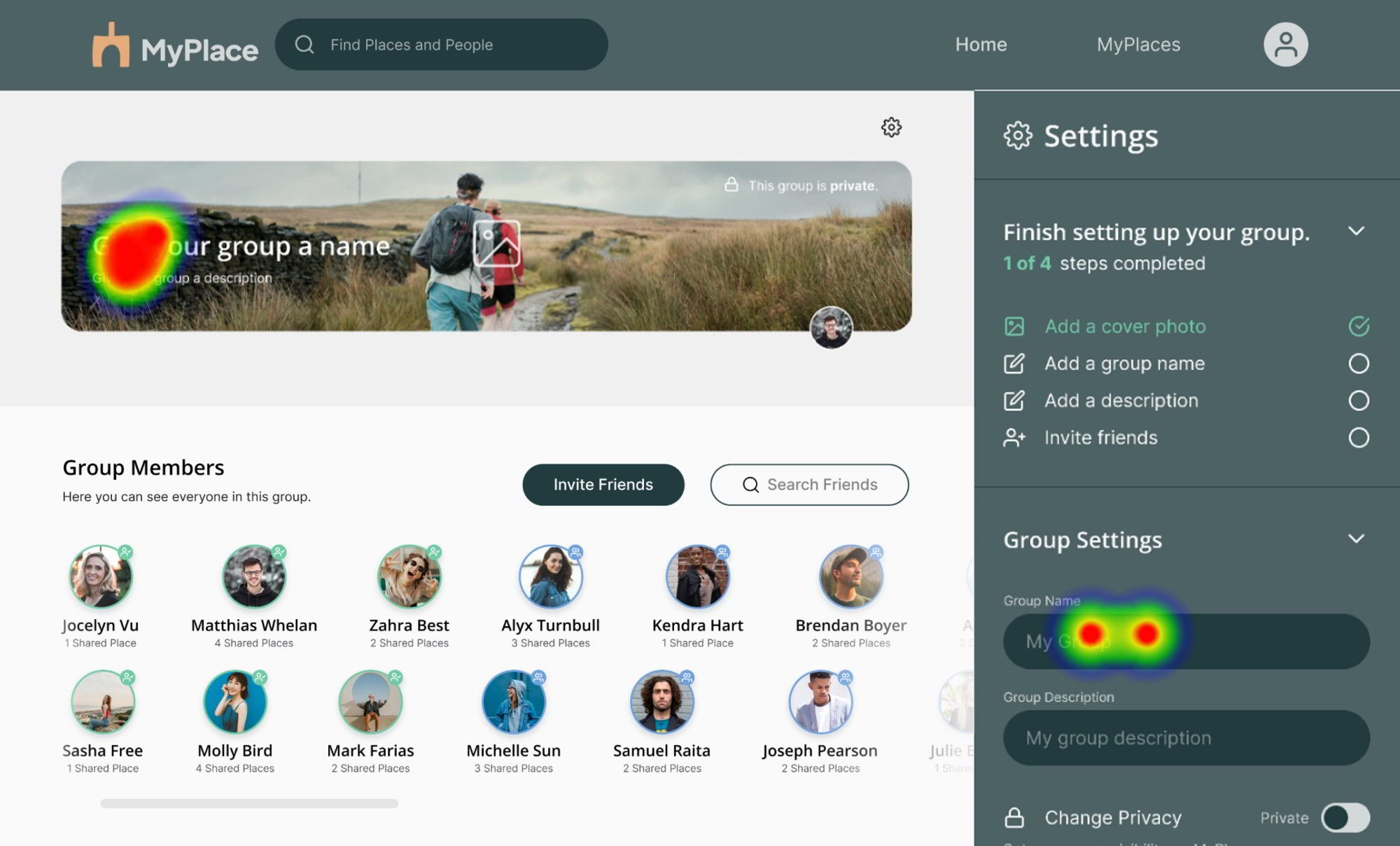
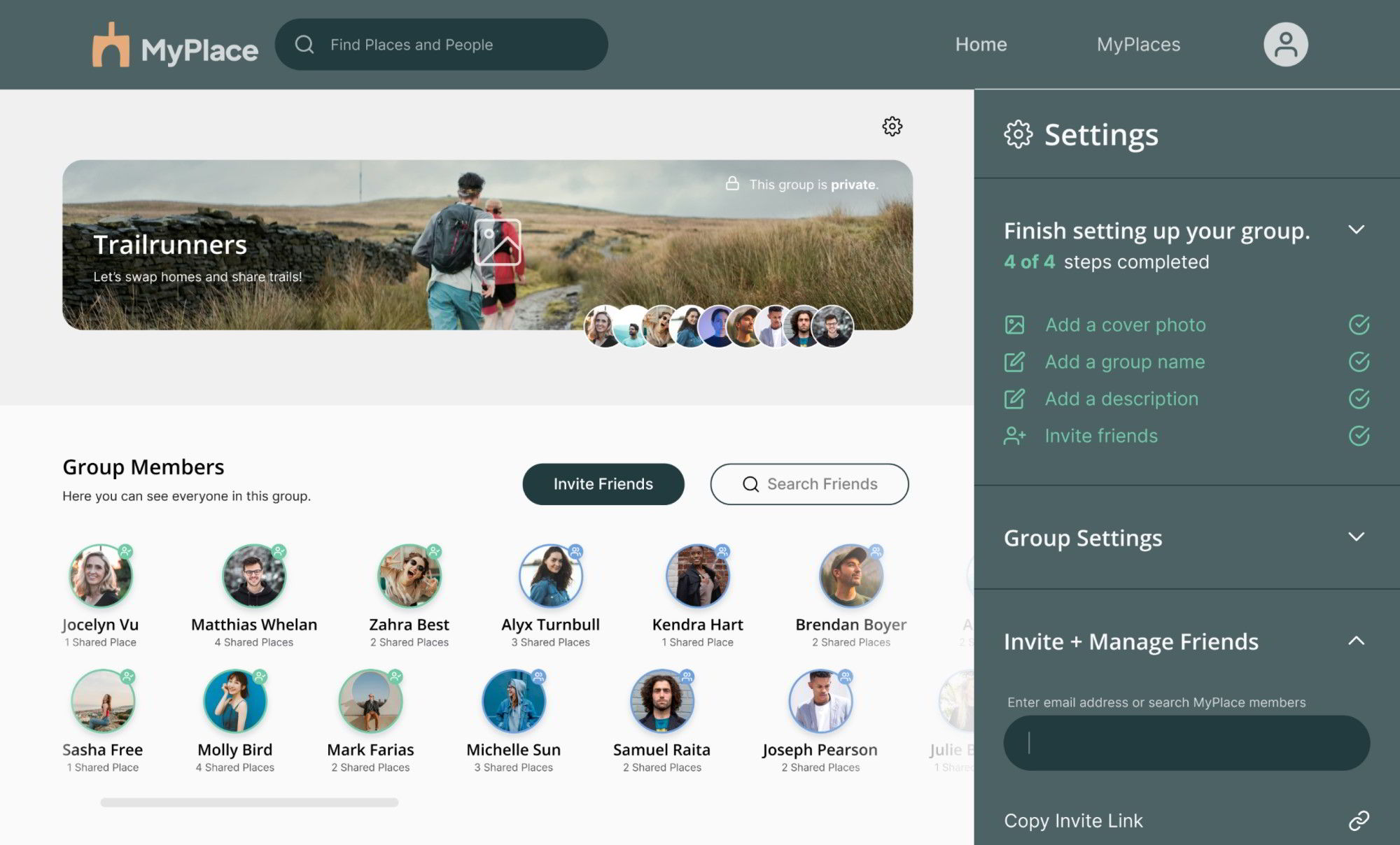
Our hi-fidelity prototype focuses on allowing users to create groups on MyPlace with ease through a guided process starting with a clear call-to-action on the Home page. The group creation user flow and managing members user flow have been consolidated into one seamless settings panel accessible directly from the group page. These two improvements result in all users being able to both create and manage their groups with ease.
How we addressed user concerns:
Added a value proposition on the home screen where users can find information quickly and easily on how they get to control how their home is shared = security & privacy
Added an option in the Group Settings where users can choose whether they want to allow all users the permission to add/remove group members, or only themselves as the admin.
Usability Testing
With the prototype created I formed a testing script with scenario and tasks for the user to complete to validate the prototype with real users. To test the prototype I used Maze and gathered feedback following every task.
Test outcomes
Having tested the prototype, I learned users were able to find the initial call to action with ease which should improve the number of users creating groups on MyPlace and give users a sense of empowerment.
Three key learnings
1. Design thinking is not always linear. It requires the ability to pivot as the problem becomes more focused and revisit previous stages to clarify that focus.
2. It’s important to stay obsessed with the problem, not my design solution. The solutions will always be iterative and adapting to user needs and business goals.
3. Businesses won’t always have a clearly defined problem in their brief. Be ready to ask clarifying questions and don’t be afraid to push back on ambiguity to get a deeper understanding.
Next steps
If I had more time to iterate on this design I would focus on areas where usability testing revealed misclicks in order to improve the overall ease of creating and customizing groups on MyPlace.
